EMD on audio - wav and recurrance plots
Update: Code and direct access to examples can be found on my GitHub reccurrence-plot.
There was an idea that has been bothering me for past few months, but due to time restrictions and many commitments I just couldn't do it. Then came the conference quite far away and few transit hour at an airport. And now, few words about it.
Question: What do you get when you perform EMD on an audio?
Sound is nothing else than a vibration of the air in area where we happen to be. Human ear can register vibration of frequency roughly between 20 Hz and 20 kHz. In order to fulfil Nyquist sampling (in essence, the fastest frequency one can detect is up-down-up-down..., i.e. half the sampling rate) we need to record with at least 40 kHz sampling rate. Taking into account some additional technical difficulties and just in case sounds are typically recorded at sampling rate around 44 kHz. But there is also stereo, and... well, my point is, there is a lot of data in 1 second of sounds. For most common methods of signal analysing, say short-time Fourier transform or filters, processing is relatively fast. However, in case of EMD it is not that good. The longer the signal the more extrema in it leading to extending time of spline computation (e.g. cubic needs to know all extrema) and increase number of iterations. Needless to say, decomposing 3 min song gives very small ratio of (rewards significance) / (time spent), which is the reason I'll show you result for few seconds sounds.
First sound (14240 samples) to decompose is disconnect sound. Below is figure where in red is the original signal and following rows are its IMFs (only four first and residue). All plots were normalised so that the biggest deflection is 1.
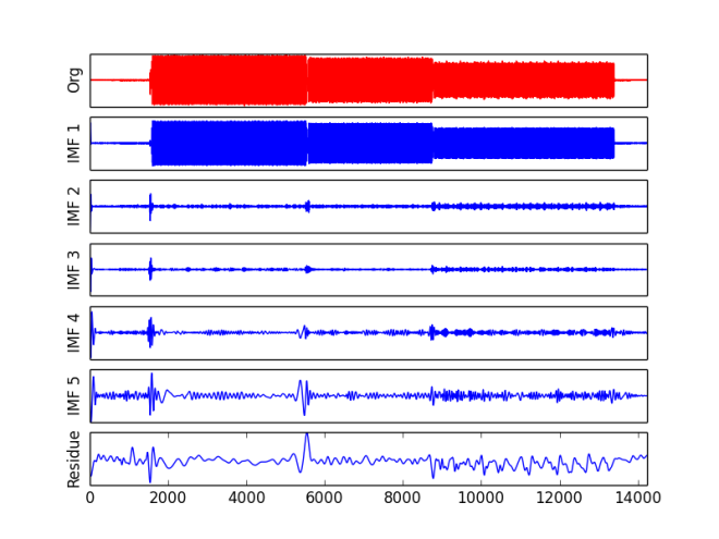
The typical result, nothing new. However, interesting is how those IMFs listen. Their audio version is available here: first, second, third and fourth IMFs. How to interpret them? Allow me not to interpret them. Thought they are quite 'noisy', I think they sound rather... interesting. The nicer part of this are the recurrence plots.
Shortly, it is an image describe by a function
\[ I(t, \tau) = \left\{ \begin{array}{rcl} 0 & \text{for} & |x(t)-x(\tau)| < \epsilon \\ 1 & \text{for} & |x(t)-x(\tau)| \geq \epsilon \end{array} \right. , \]
meaning that, if two values within signal are closer than $\epsilon$ then we draw a dot. I have modified this function slightly to increase the dynamics and instead of binary output, it gives few more values. Modified function is:
$$ I_N(t, \tau) = \left\{ \begin{array}{lcl} n & \text{for} & n \epsilon \leq |x(t)-x(\tau)| < (n+1) \epsilon \\ N & \text{for} & |x(t)-x(\tau)| \geq N \epsilon \end{array} \right., $$
where $\mathbb{N} \ni n \in [0, N-1]$. Here is a snippet on how to generate plots using Python:
import pylab as plt
import numpy as np

def rec_plot(s, eps=None, steps=None):
    if eps==None: eps=0.01
    if steps==None: steps=10
    N = s.size
    S = np.repeat(s[None,:], N, axis=0)
    Z = np.floor(np.abs(S-S.T)/eps)
    Z[Z>steps] = steps

    return Z

s = np.random.random(1000)
plt.imshow(rec_plot(s))
plt.show()
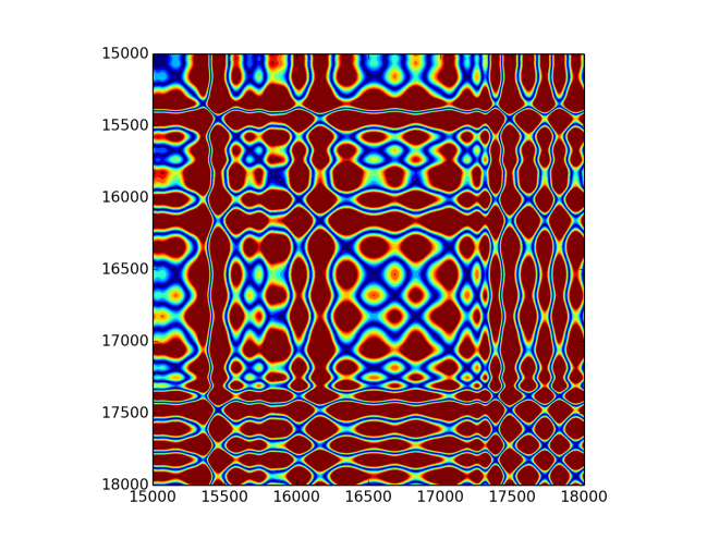
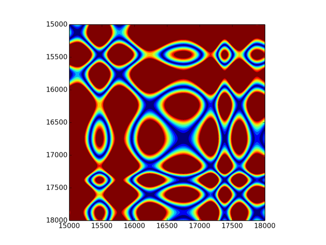
Due to the size of an image and readability, here are only smaller plots (5000 points starting from 2000th point). Below are plots for second IMF, fifth IMF and residue from subtracting five fist IMFs. With slower frequencies one can notice quite mesmerising patterns. First three IMFs are abundant in high frequencies, which makes it fast varying image. The rest, however, gracefully changes it colours in nice patterns.
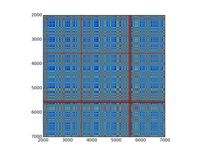

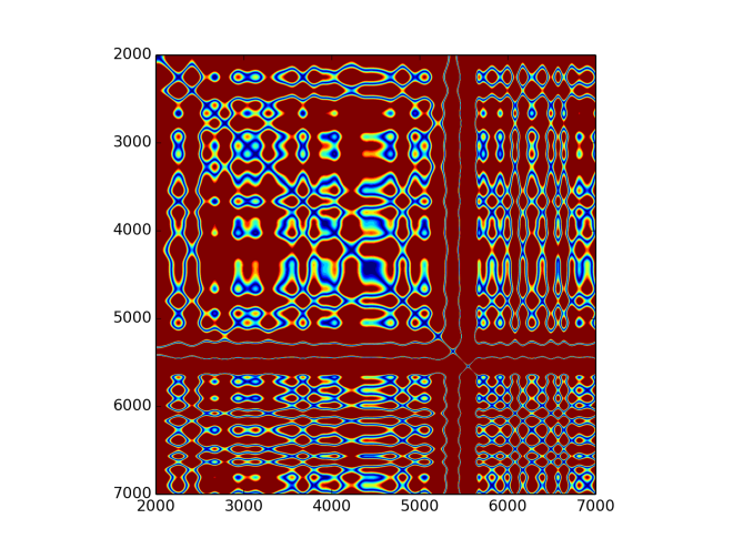
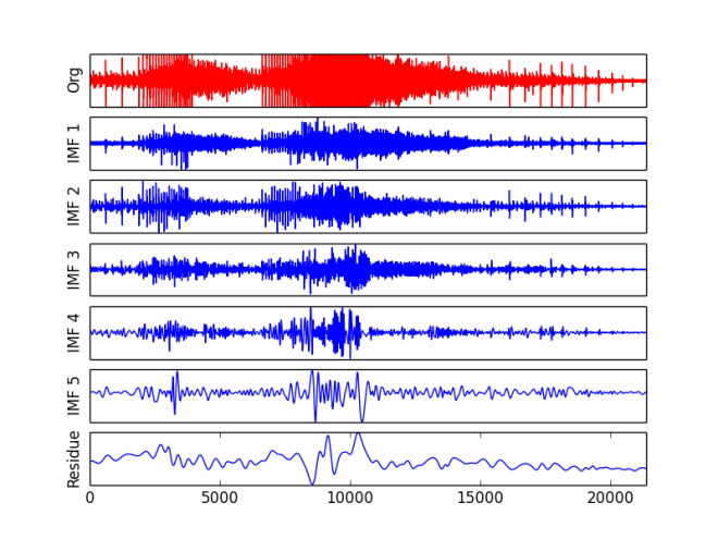
Same analysis was performed for chainsaw sound. Below are its EMD decomposition and few recurrence plots. Signal has 21381 samples, which makes it much longer to analyse. Again, for recurrence plots only time series of 3000 points were displayed. I must admit that I feel mesmerised by those patterns. Here are additionally wav files for first, second, third, and fourth IMFs.
