Plots in matplotlib pylab
When trying to explain something to someone it is usually much better to actually present it in a graphical form. For this, I'm usually using Python and its module Matplotlib. It is highly customizable package with lots and lots different display techniques both for 2D and 3D images. Great feature is that one can also create animations to include in presentations.
One of the classes in Matplotlib is called PyLab. It is meant to have the same functionality as Matlab's plotting functions. For my everyday activity that's typical more than enough. I'm not going to discuss package in details. I just want to mention few nice options when displaying and saving plot to a file.
As a default, pylab leaves lots of whitespace for axis, titles and borders. On one hand this is good, because it makes everything look really nice, but on the other, we are losing some space for actual graphs. If you are going to discuss the plot while presenting, sometimes you can remove "unnecessary" content.
Supposedly one imports pylab with [code language="python"] import pylab as py # including pylab lib [/code]
To remove ticks from axis: [code language="python"] frame = py.gca() # returns (gets) current axis frame.axes.get_xaxis().set_ticks([]) # removes all x axis ticks frame.axes.get_yaxis().set_ticks([]) # removes all y axis ticks [/code]
To change the distance between subplots and margins: [code language="python"] py.subplots_adjust(left=leftMargine, bottom=bottomMargine, right=rightMargine, top=topMargine, wspace=widthSpace, hspace=highSpace) [/code] Parameters left, right, bottom and top refer to location of the grid corners. Wspace and hspace are respectively horizontal and vertical spaces between subplots. Pylab can actually do it by itself, but the result is not always the best possible. Command to do it automatically is [code language="python"] py.tight_layout() [/code]
On top of that, one can also remove unnecessary white space in output when saving to file [code language="python"] py.savefig(filename, bbox_inches='tight') [/code] where the 'tight' indicates cropping margins.
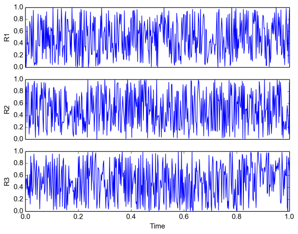
Here is a short snippet where those functions are applied: [code language="python"] import pylab as py import numpy as np
N = 500 t = np.linspace(0, 1, N) s1 = np.random.random(N) s2 = np.random.random(N) s3 = np.random.random(N)
py.subplot(311) py.plot(t, s1) py.ylabel('R1') py.gca().axes.get_xaxis().set_ticks([])
py.subplot(312) py.plot(t, s2) py.ylabel('R2') py.gca().axes.get_xaxis().set_ticks([])
py.subplot(313) py.plot(t, s3) py.ylabel('R3') py.xlabel('Time')
py.savefig('output', dpi=150, bbox_inches='tight') [/code]
